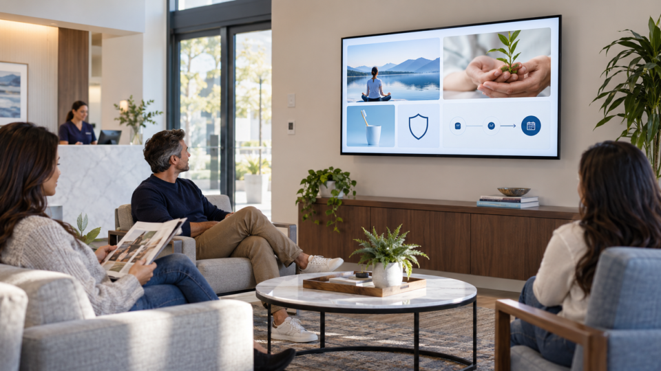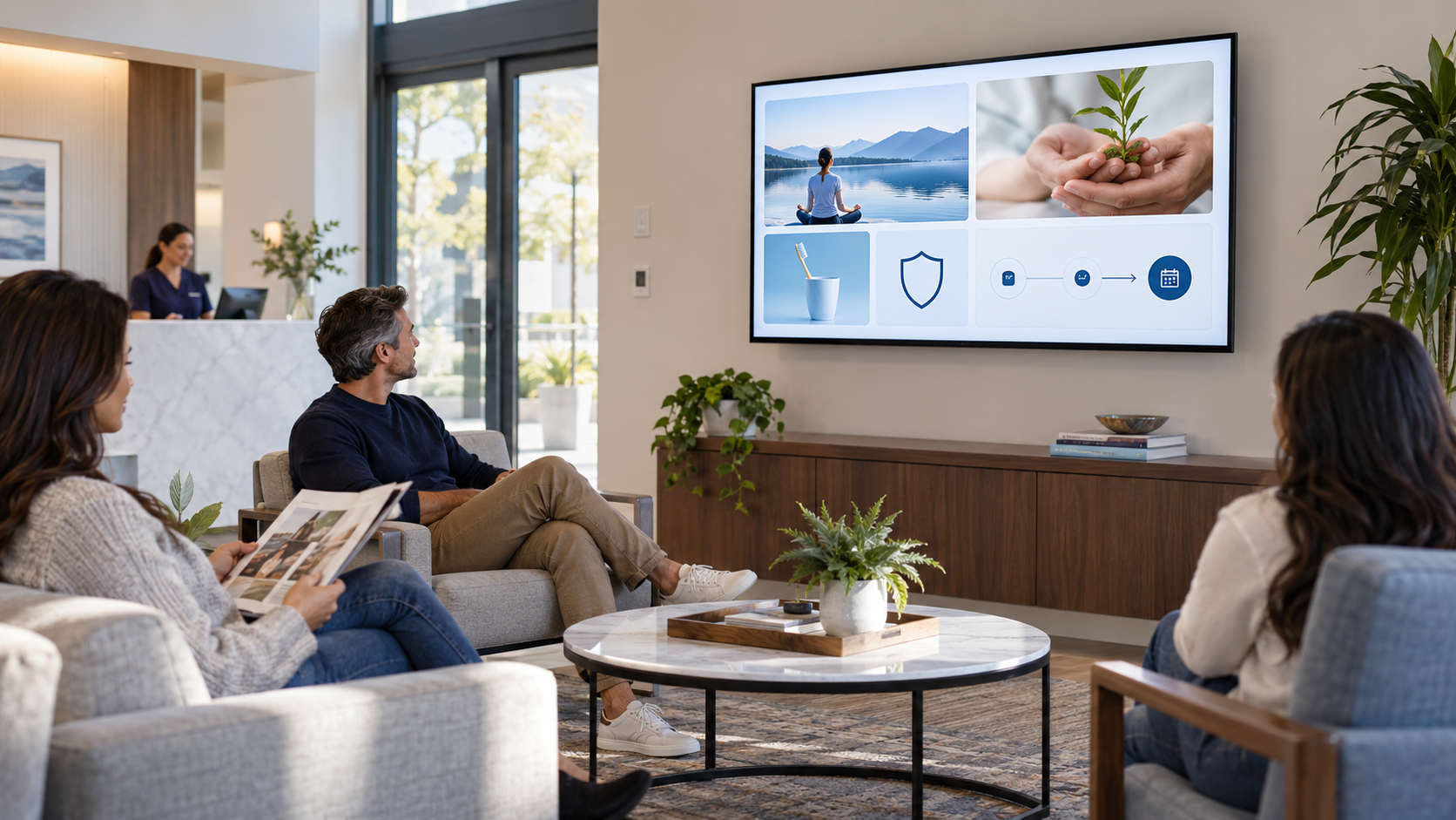
A useful customer-facing screen earns attention by helping someone in the room. It does not need to be flashy, busy, or packed with every service you offer. It needs a clear message, a reason the message matters, and an appropriate next step.
Five tests for every screen
Can someone understand it at a glance?
Use a short headline, large enough type, and one central point. Watch it from the farthest likely seat, not just from the editor.
Does it fit the customer moment?
A waiting room, checkout counter, treatment area, and restaurant table have different needs. Content should reflect what a person can use there and then.
Does it explain why the message matters?
“Ask about memberships” is weak on its own. “Ask what your membership includes before your next visit” gives the customer a reason to engage.
Is it accurate and current?
Check prices, dates, service names, QR links, photos, and claims. Have the right person approve health, legal, financial, or technical information before it plays.
Does it have only one next step?
Ask, scan, book, join, or learn more. Choose one. Multiple competing calls to action make a screen harder to use.
What a useful screen is not
- Not a tiny-print brochure.
- Not an unverified claim or invented statistic.
- Not a generic stock-image loop with no business purpose.
- Not a replacement for a professional conversation or individual advice.
- Not a message that stays on the screen after it becomes outdated.
Build the message before the design
Write one sentence: “Before leaving, I want this customer to know ____.” Then decide whether the job is education, promotion, trust, or action. That sentence keeps the visual simple and the playlist focused.
For a full framework, read The 4-Part Screen Mix and 25 Useful Waiting Room TV Ideas.
Turn the idea into a screen
Pair and Play helps businesses create and manage customer-facing content that is practical in the room, not just good-looking in a dashboard.
Start at $0 today with two included screens. See current setup options.