Branded AI digital signage should look like it belongs to your business while keeping the customer message clear. Start with an approved logo and useful color direction, then inspect the finished design for the details that make the brand recognizable.
In Pair and Play’s Screen Maker, a logo is an optional input. You can use it alone or combine it with a photo, description, or exact wording. You do not need to supply all four. When a particular brand detail matters, provide it clearly and review how the design handles it.
Use the approved logo file
Choose the current logo rather than a small screenshot copied from an old flyer. Use a clear file in a format accepted by the upload control. If you have separate versions for light and dark backgrounds, choose the one intended for the design you want.
Check the file before uploading. Does it contain the right business name? Is it the current mark? Does it include unwanted surrounding artwork, a tagline that no longer applies, or a background that will look awkward in the screen?
Keep a copy of the approved source for comparison. If a designer supplied rules about clear space, minimum size, or permitted backgrounds, use those rules rather than inventing a new treatment for every TV message.
Add enough color direction to guide the result
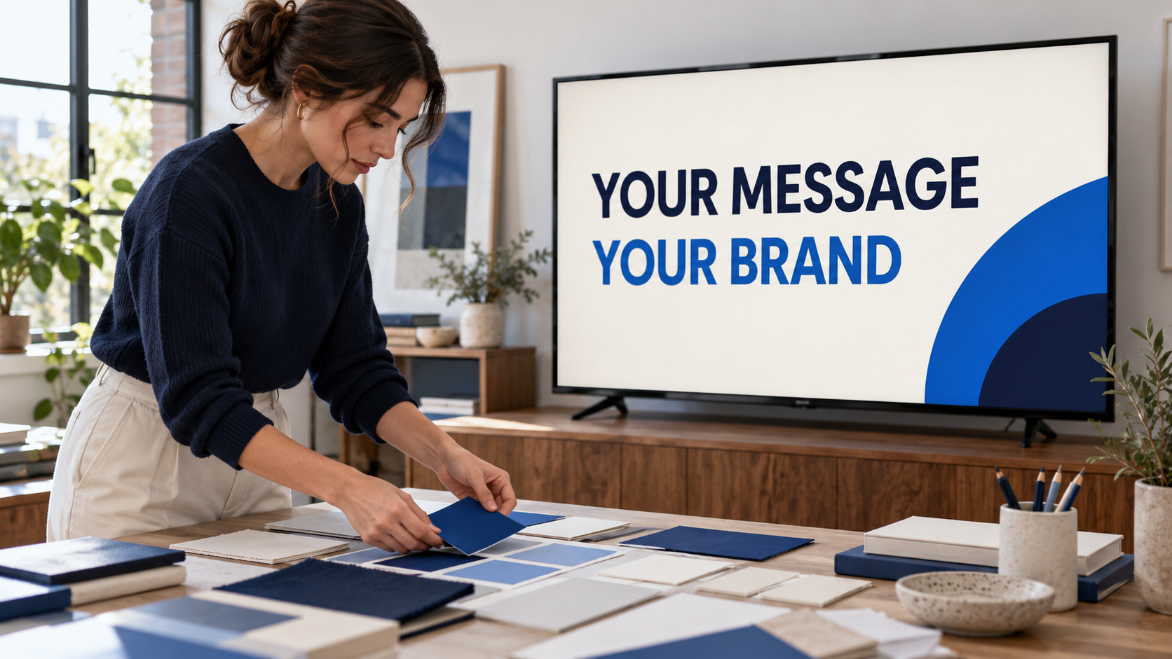
A simple description such as “Use our navy and blue with a clean white background” can give the design a direction. If your business has approved color values, include those details when exact matching matters. Keep the wording ordinary and specific.
Choose a background and text combination that remains readable in the room. A pale brand color may work as an accent while a darker color carries the headline. You do not need to use every brand color on every screen.
Do not assume a supplied color value or logo locks every future generation to a perfect brand system. Review each result. The actual TV check matters too, because the final appearance is what customers will see in that environment.
Give the logo a clear role
The logo helps a viewer recognize the business; the headline explains the message. If the logo dominates the whole screen, the customer may recognize the brand without discovering the service or next step you wanted to introduce.
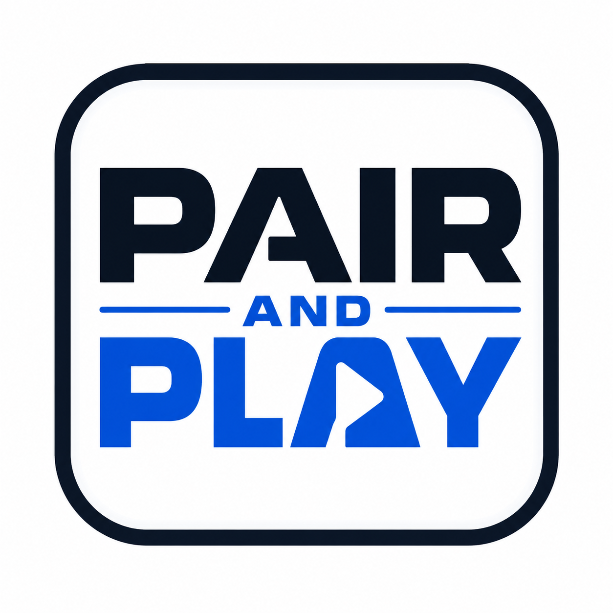
The layout study below uses Pair and Play’s own authorized logo. Both panels use the same original file. The change is the balance between the logo, message, and action—not a claimed Screen Maker output.
Crowded direction
Show your services. Share your offers. Introduce your team. Explain your process. Ask us about getting started.
Clearer direction
What should customers know before they leave?
Ask about your first screen.
Compare the generated logo with the source
Look beyond whether the design feels attractive. Inspect the business name letter by letter. Check the mark’s shape, spacing, proportions, colors, and any tagline. Make sure nothing has been added or removed.
For Pair and Play’s logo in this example, that means checking the words, the surrounding shape, and the distinctive play-symbol detail. For your business, identify the features that must remain intact. A logo that is almost right may still be an incorrect version of your brand.
If the result changes the mark, request a correction that names the problem. Ask to preserve the supplied logo and adjust the surrounding layout. If the tool still cannot produce an acceptable treatment, use an approved design prepared with the original logo intact or involve your designer.
Ask for a specific correction
Instead of “make it more branded,” describe what needs to change. For example: use the approved light-background logo, reduce its size, give it clear space, use dark navy for the headline, and remove the extra accent color.
Keep the main message in the same revision request when it must remain unchanged. Then recheck the whole design afterward. Improving the color treatment should not introduce a new offer, altered price, or different next step.
The simple AI brief examples show how to provide useful direction without writing a long prompt.
Build consistency across the rotation
Choose a few repeatable decisions: a sensible logo position, readable headline treatment, restrained palette, and a clear action. Different screens can still use different photos and messages. Consistency should make the business recognizable while allowing each idea to do its job.
Review several screens together on the TV. Check that text remains readable, important content is not cropped, and no design looks like it belongs to a different business. Remove outdated logo versions from your working content choices so staff do not reuse them accidentally.
When a design is ready, confirm the business and active playlist before using Approve and add to playlist. The Screen Maker walkthrough explains approval and placement. For the broader content standard, see what makes a useful customer-facing screen.
Start My 14-Day Screen Test with one approved logo and one useful message. Judge the finished design by brand accuracy, readability, and how clearly it serves the customer moment.