A product photo TV promotion starts with something customers can actually buy from you. Use the photo as the visual anchor, give the screen one clear job, and check that the finished design still represents the product accurately.
You do not need a long design brief to get started. In Pair and Play’s Screen Maker, you can provide a photo, a description, a logo, or exact wording. Each is optional; one can be enough. Adding an approved headline is useful when the promotion needs particular wording, but it is your choice.
Choose the customer moment before the layout
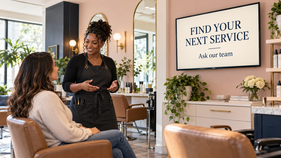
Where will someone see the screen, and what should they do next? A café counter message can invite an order. A retail display can help customers find the featured item. A salon screen can prompt a question about a product used during an appointment.
Those jobs need different messages, even when the photo is the same. “Ask about our take-home range” helps a salon client discover a category. “Find this by the front desk” helps someone locate an item. Neither needs a fabricated discount or a claim that it is the best seller.
Start with a photo that tells the truth
Choose a sharp image of the actual product or a representative image you are entitled to use. Check packaging, colors, labels, portion size, included accessories, and any details that distinguish the item. Clean the lens, use even light, and leave some space around the subject so the design has room to work.
A close crop can look attractive on your phone yet leave nowhere to place a readable headline on a wide TV. Take a second, wider photo if the product fills the frame. Avoid asking AI to reconstruct a label, invent an unseen accessory, or make the serving appear larger.

Three useful directions from the same coffee photo
The photo above supplies the visual. These three short briefs change the communication goal. They are examples of optional direction, not a required prompt formula. The business must approve any service or availability mentioned before using a version in its own café.
1. A simple invitation at the counter
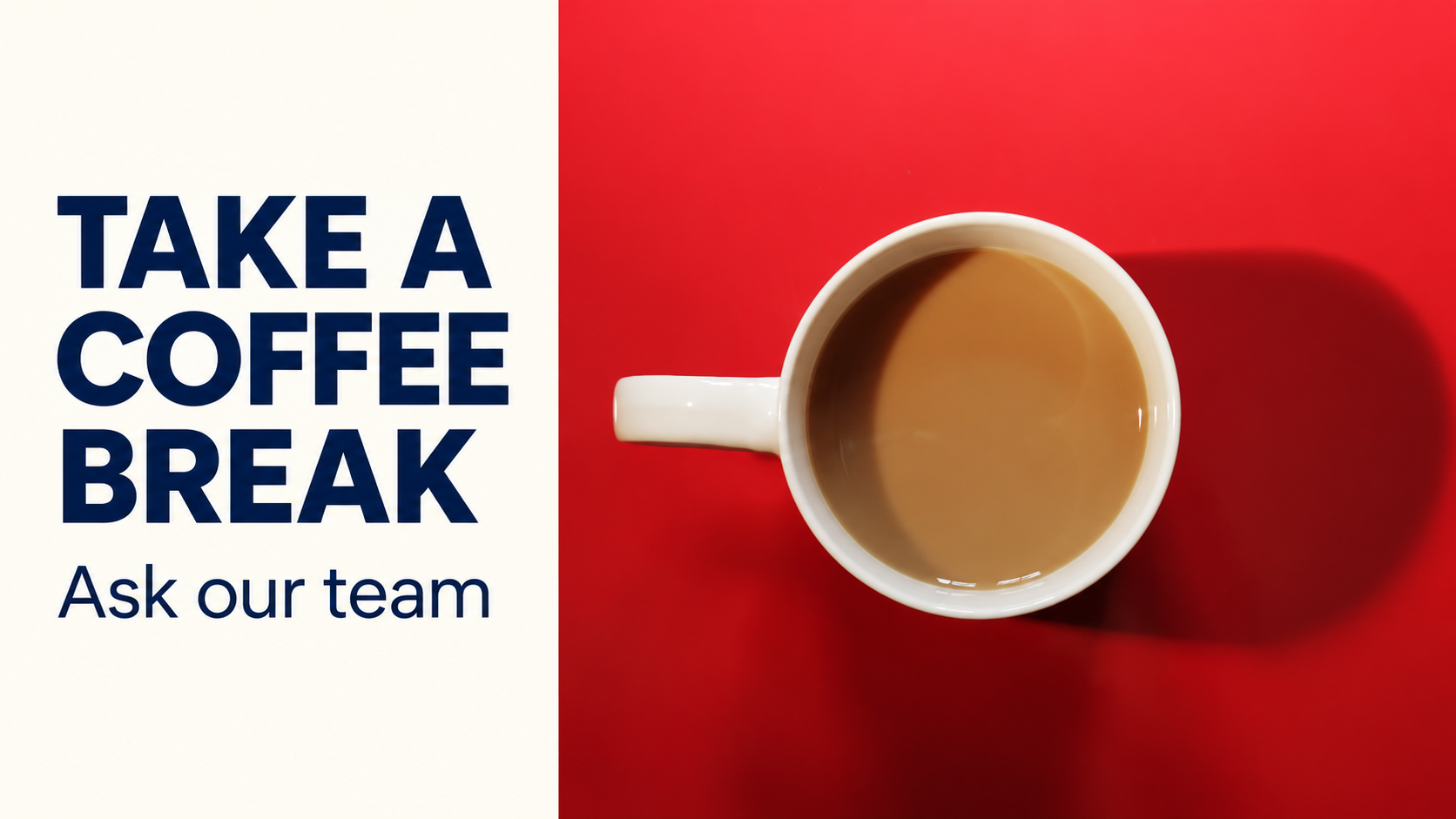
Use this coffee photo for a calm café TV screen. Exact wording: “TAKE A COFFEE BREAK” and “Ask our team.” Keep the cup recognizable and the headline easy to read.
This is the most general option. It works when the aim is to draw attention to the coffee itself without introducing an offer, price, or service that needs further explanation. The next step is a conversation with the team already serving the customer.
2. A prompt for a service customers may overlook
Use this photo to introduce our meeting coffee service. Exact wording: “COFFEE FOR YOUR MEETING” and “Ask about ordering ahead.” Use a clean, professional layout.
This direction makes sense only if the café really offers that service. It gives the screen a discovery job: someone buying one drink may not know the business also handles a group order. The staff should have the order process, lead time, and options ready when asked.
3. A focused tasting or seasonal message
Create a screen using this photo and our approved wording: “TRY THIS WEEK’S FILTER COFFEE” and “Ask what’s brewing.” Leave the drink appearance unchanged.
This version invites a specific question without inventing tasting notes, origin, price, or availability. Use it only while the featured drink is available, and give one person responsibility for removing it when the message becomes out of date.
Review the finished design against the original
The featured image on this article illustrates the first direction: the real coffee photograph forms one part of a wide layout, with a short headline and a clear action beside it. It was created as an editorial example with AI, rather than captured from Pair and Play’s Screen Maker.
Before approving your own design, compare the cup or product with the source photo. Are the shape, label, color, quantity, and important features still right? Has any new object appeared that could suggest an included item? If the product has changed, request a correction or use another design.
Then read every word. Check spelling, prices if present, dates, conditions, and the next step. A polished layout does not make an invented claim accurate. Give the review to someone who knows what your business actually provides.
Check the TV, then place it in the right rotation
Look at the result from the customer’s normal position. The product should remain recognizable, the headline should be readable, and the action should make sense without audio. If the design feels crowded, remove a secondary detail or make a separate screen for it.
In Pair and Play, check the selected business and active playlist before choosing Approve and add to playlist. Confirm the result on the intended TV afterward. The first-screen walkthrough explains that review and placement sequence.
Keep this promotion beside useful context, rather than repeating the same product throughout the rotation. A café could pair it with ordering information and a team introduction. A retailer could pair it with a product-use explanation. The guide to useful customer-facing screens helps you decide what earns a place.
To try the approach, choose one real photo and one customer question. Start My 14-Day Screen Test, create a design in Screen Maker, and judge the result on your own TV. For the broader process, see how to create digital signage content with AI.